Prove the ROI of every automation
The Value Dashboard turns your automation activity into concrete numbers — hours saved, issues auto-created in Linear, Jira, or GitLab, friction patterns by severity. Share it with your team lead to show exactly what Deviera is doing for your engineering velocity.
What you can measure
Every automation event is recorded with the trigger type, outcome, severity, and an estimated time saved. The Value Dashboard aggregates these into actionable ROI metrics.
Hours saved
Every automation that fires is assigned a time-saved estimate based on the trigger type. CI failures caught automatically save ~30 minutes of manual triage. The dashboard totals these across your workspace.
Automations fired
Total automation executions over any time window — broken down by trigger type, action type, and severity. See which automations are working hardest for your team.
Issues auto-created
How many structured issues Deviera automatically opened in Linear, Jira, or GitLab on your behalf. Each issue includes full context — repo, branch, commit SHA, workflow name, and a reproduction checklist.
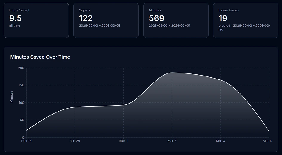
Velocity trend
Weekly time-series chart of automation activity. See whether friction is increasing or decreasing over time — and correlate spikes with specific events.
How minutes saved are estimated
Each trigger type has a default time-savings estimate based on the average manual effort avoided when Deviera catches the event automatically. These are conservative baselines — your actual savings depend on team size and workflow.
| Trigger | Default estimate |
|---|---|
| CI failure on main branch | 30 min |
| Flaky test detected | 45 min |
| Stale PR (> 48 h) | 20 min |
| Deployment failure | 30 min |
| Issue labeled "bug" | 10 min |
| PR merged (changelog) | 5 min |
| TODO/FIXME committed | 10 min |
Trigger baselines are configurable per workspace from the workspace settings page.
Full feature breakdown
Time-series chart — daily or weekly automation activity over 7, 30, or 90 days
Top automations — ranked by signals fired, hours saved, and issues created
Breakdown by severity — critical, high, medium, low signal distribution
Breakdown by trigger type — which friction patterns are most active
Auto-close tracking — how many issues were resolved automatically
Per-repo breakdown — which repositories generate the most friction
Built with Recharts
The Value Dashboard uses interactive Recharts components — hover any data point to see the exact count, zoom into date ranges, and switch between daily and weekly aggregation. Charts are responsive and work on any screen size.
Available on Pro and above
The Value Dashboard is unlocked on the Pro plan. Free workspaces see the Signal Feed (last 7 days) but not the ROI charts or time-series analytics. All new workspaces start on a 14-day Pro trial — no credit card required.